|
For this assignment, we were supposed to create a logo. I decided to make a logo an obscure indie recording studio would most likely have, and what's more obscure than a dog made of clay. I have discovered the existence of clay dogs, and the sight of a very awkward-looking animal accumulates innocent joy that comes from the pit of your heart, which was the reason why I had chosen it. I would say that trying to nail a very watered-down version of a dog's anatomy was the most tedious, as well as simplifying and "translating" the design to look very geometric and simple looking as possible. While it is rather detailed for a logo, I still had to make it so that it wouldn't look like the other dogs. 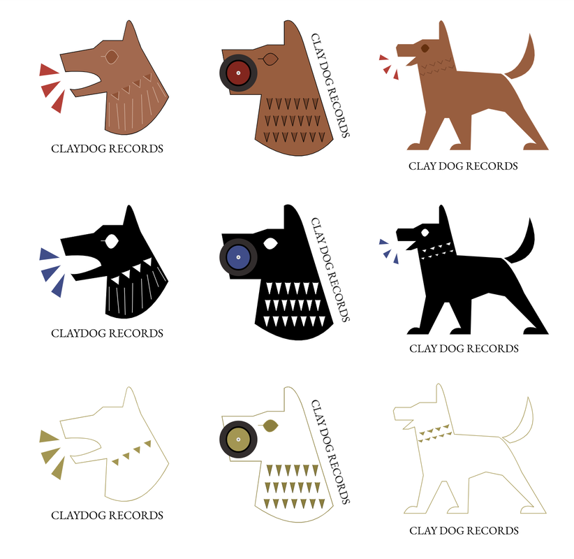 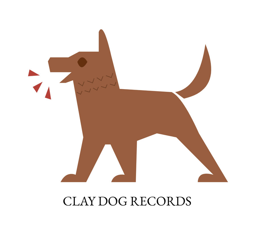 Most appealing logo
0 Comments
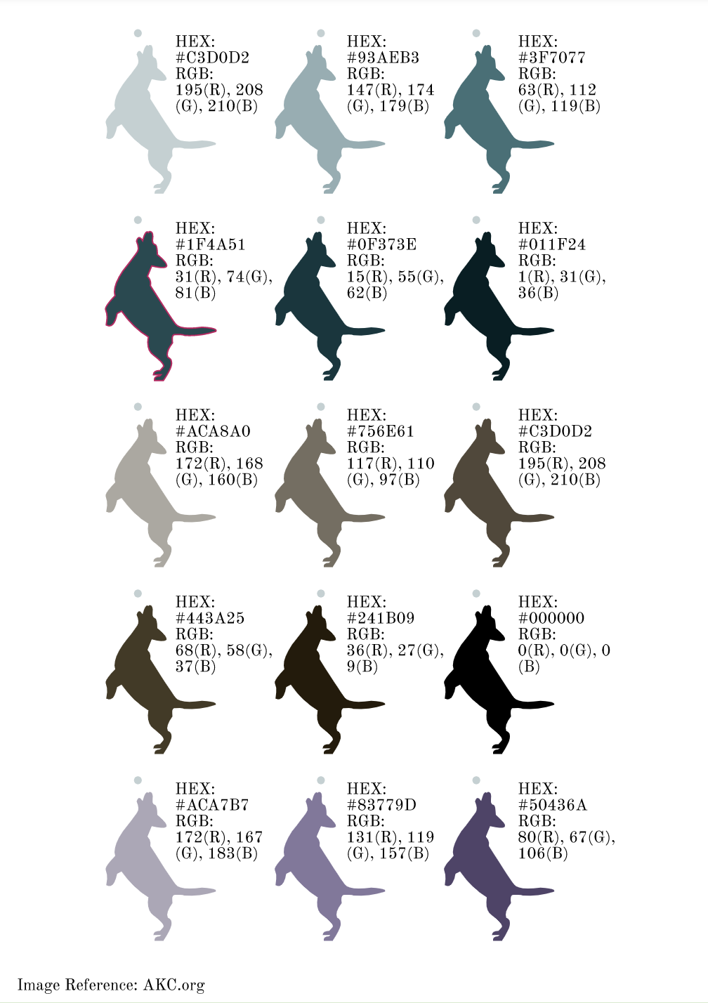
Our task was to brainstorm a logo for a company or to represent a product or ourselves. Lately I've been researching on old civilizations and particularly the Romans, Etruscans and the Neo Assyrians, for the sake of creating the setting of my graphic novel. So as a creator, I saw this as a perfect opportunity to practice on nailing that Assyrian clay dog figurine look. In addition, I inspired by those obscure, hippy record companies that nobody knows of, that only sell their albums digitally on SoundCloud. 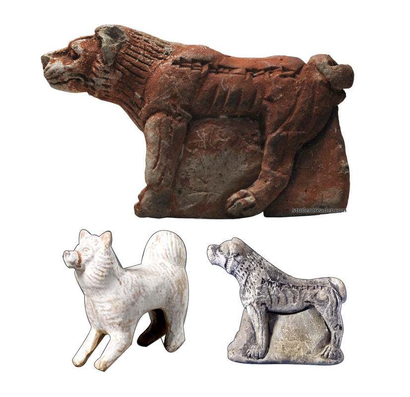 As I progressed, I tried to make the designs more simplistic for my sake. Originally for the rough draft, I wanted to use lines and streaks for the dog's mane(?), then I switched to using almost-triangles. Midway through, you can see that I added in three triangles to represent barks, in a way, to represent song. I threw my ideas onto the paper with whatever design or feature I added or removed from the drawing. While similar, I tried to make them slightly different, since small details can surprisingly add another whole feeling to the logo when viewing it alone. One of my favorites are number 5 and6. 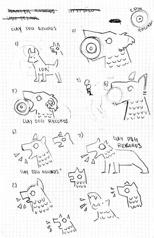 This unit, we learned the concept of using RGB and hexadecimals (more commonly known as the hex color code) for color on a graphic design, since we are lazy and do not have time to imitate the color that we like on a project, and would much rather copy and paste a few numbers into a system that would immediately fill a graphic on the design with the desired color. First of all, the RGB works in a very particular way using particular colors, Red, Green, and Blue, if it weren't obvious already. Why is it formatted that way? RGB is formatted the way it is since its the primary hues of light. When you input a random digit, for the green, for example, it would look like (0, 63, 0), and since there is no other input in the other colors. Hex codes uses both numbers and letters. A color input which would be one long number in RGB format, is represented by a letter (ranging from A, B, C, D, E, and F) to make it even more easier for the graphic designer/programmer/web creator. Color NamesFor this project, we had to prove that we were paying attention to the lessons, by creating a canvas of the same or multiples of the same object colored in gradients of a hue. Then we had to list the Hex and RGB codes. As you can see, I decided my object should be a dog. Surprisingly enough, after several experiences of toiling with the pen tool, I outlined the shape of the dog rather quickly, which I am not sure how I even achieved to do. I had to make some alterations, because I was later told that the RGB had to be in one pair of parentheses. I think I did a somewhat good Job on Gravit, but my handiwork could have been better. 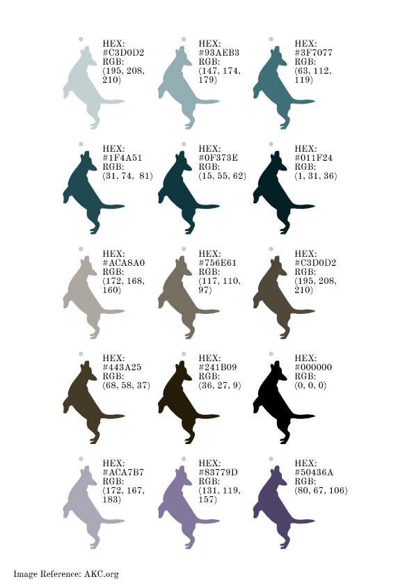 Color SchemeFor this project, we had to create color schemes, allow me to explain what all of these mean. A analogous color scheme is when the colors are right next to each other on the wheel. A triad color scheme consists of three colors that are the contrary of each other, and equidistant. A Complementary color scheme uses one base color and its complement, the color on the exact opposite side of the color wheel. Monochromatic color schemes often stick to one tint, but show it's various gradients. In this project, I decided to go for a retro sunset theme, and It honestly was not hard, and It took me little time to finish it. I encountered no challenges whatsoever. Of course, I used the shape tool, masking tool, and pen tool to create this project, as well as Adobe Color in addition. Adobe color provides options for these types of color schemes and many other kinds as well. You just have to click on what kind of scheme you would want to create, and drag around the selectors on the color wheel to create the color scheme you want. 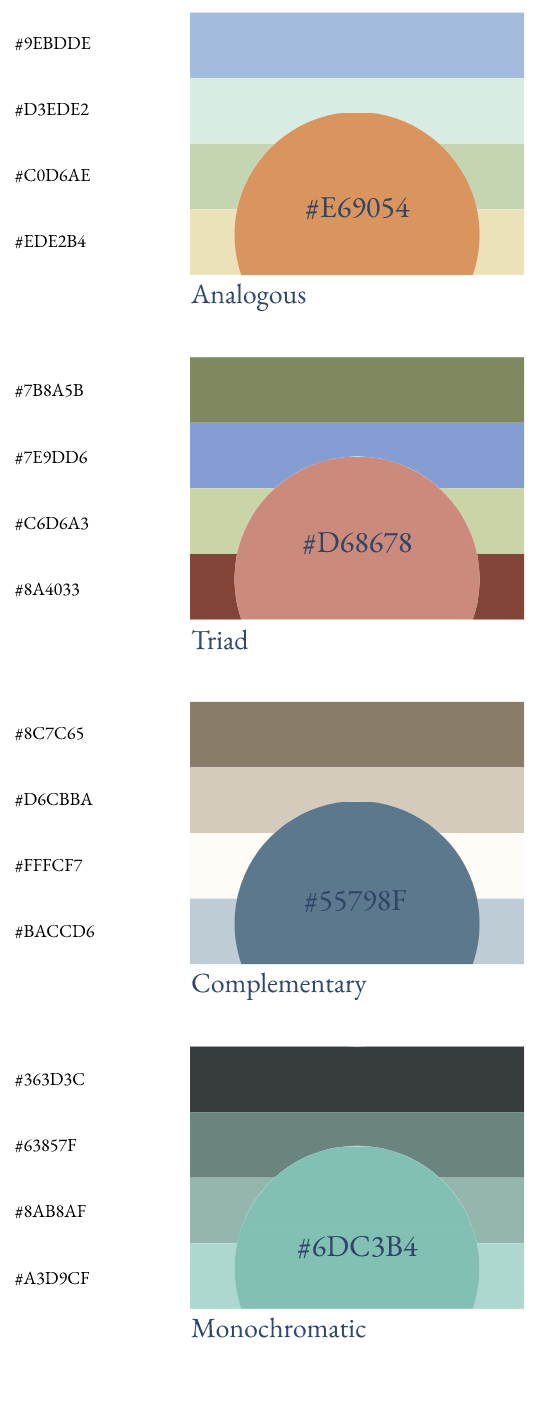 I didn't face something that I would necessarily call a challenge, however, I think the lengthiest process I went through while creating this project was writing down the Hex Code and RGB, and it was rather hard to remember the RGB since you can't copy and paste it like you could with the Hex Code, however there was no light bulb genius moment, I just had to deal with the lengthy process with patience. I personally think that I succeeded in tracing the picture with the pen tool, to make a silhouette of a decent-looking dog. For this particular project, I used the Pen tool and textbox option in Gravit.
 Typography is the appearance or style of the text, something that we encounter often in the digital world and especially in graphic design. Typography is important because you want to deliver your ideas and messages in the demeanor that you mean it to be to your reader/audience/viewer, but if handled incorrectly, your audience would be confused. “Each font has a personality and a purpose”. The quote I just wrote above means that the kind of font will impact the overall personality of the creation, design, or message, and how your audience will perceive it. Writing a letter to your boss in Comic sans is not a good idea, as it would give the receiver the wrong idea. In this particular unit, we learned the five "genres" of font, listed below; Serif Font - Has "feet", and usually used in large blocks of text, and is often used in print. Sans Serif - Does not have "feet", and is good for headlines, titles, smaller chunks of text, and used often on the web. Monospaced - Each letter takes up the same amount of space, doesn't work well for large blocks of text, and is often used in coding. Script/Handwritten - Cursive, calligraphic, or handwritten, sometimes difficult to read, good for logos, large headlines, and details. Novelty - Good attention getters, best used sparingly, for emphasis like in an infographic or poster. It could also be used as a title if readable from a distance. Many times, the popularity of a font comes and goes. Typeface ComparisonIn this assignment, we were instructed to find five fonts that both individually belong to different categories of font; Serif, Sans Serif, Monospace, Novelty, and Script. Then we were supposed to give examples of that font in a sentence. For this assignment, I used; Old Newspaper Types, Sans Serif Shaded, Bittypix Monospace, Marcelle Script, and Fh Script. 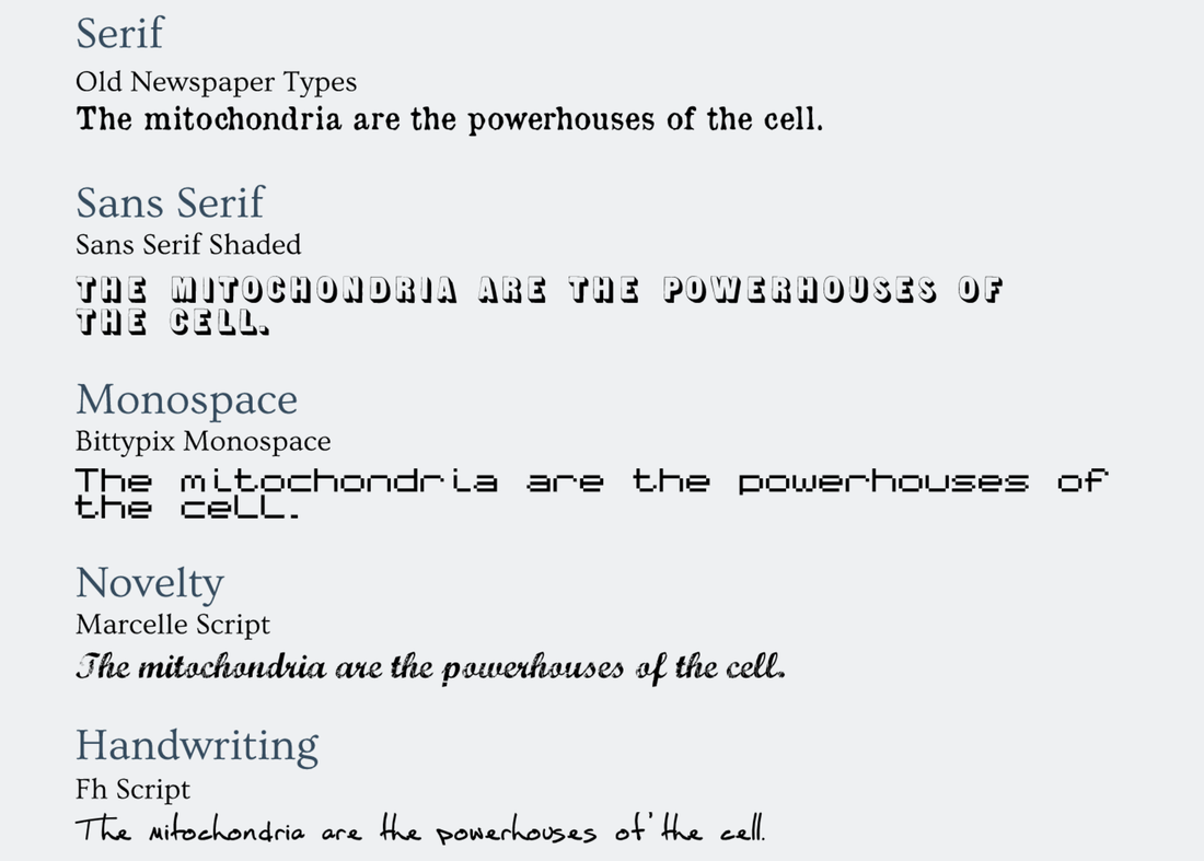 Word PorFor this project, we were expected to create good and bad examples of font uses. For this project, I had to get creative and try to think up of very bad examples. Personally for me, I think the best example of a bad font was when I wrote "Die Hard", a christmas Movie, in the Mountains of Christmas font. A very valuable lesson I learned in this Unit, was spacing and alignment. The importance in spacing and alignment is that if the fonts aren't well aligned, the viewer would have difficulty reading, which is why you should use center alignment only for the title, or don't use it at all. 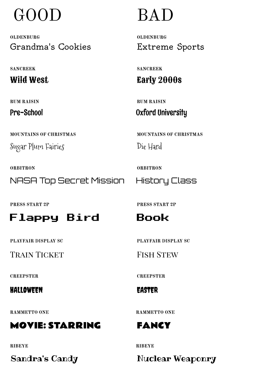 This time, we were all assigned to redo the pen tool exercises. For the first, we drew mainstream-culture superhero logos, in order to relearn the basics. As for the other, we had to rescue Abraham lincoln's face from his copper prison chamber using our trusty Pen Tool. After completing the two warmups, we had to use creative common images to create a scene or a picture, using the pen tool and the skills we learned along the way. Some of the challenges that I had faced, were outlining the feathers of the birds, and it was time consuming, and trying to make the pictures look like they belonged there, by manipulating the shading, gradients, and color, which took even more time since I had to get creative and experiment with the color tools, but it the end, I would consider the result was worth the effort. (All of the original creators' names and website links were listed below. All images are protected under creative commons and taken from Unsplash, a website for free use images.) 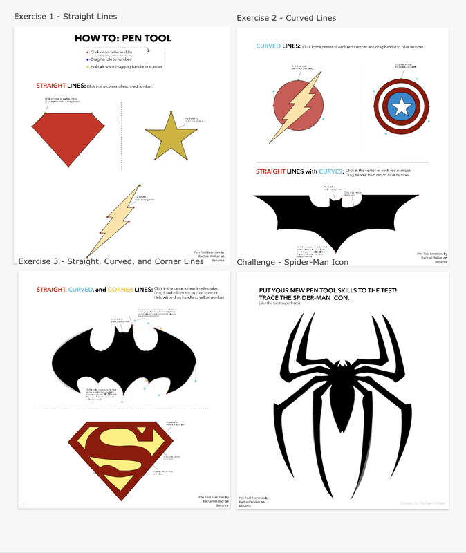 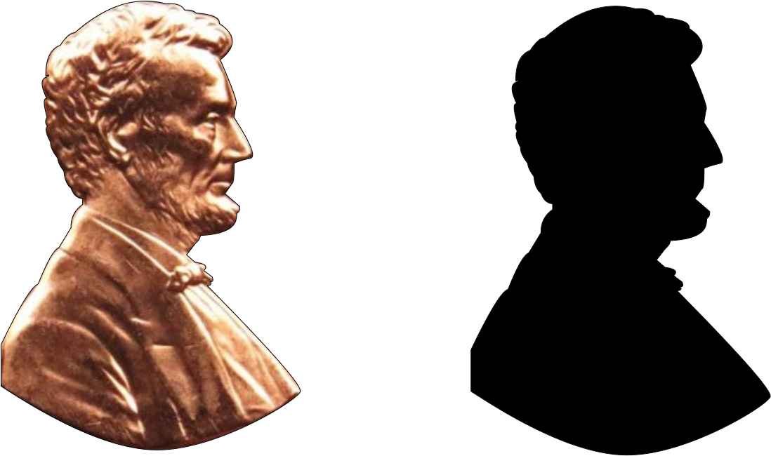 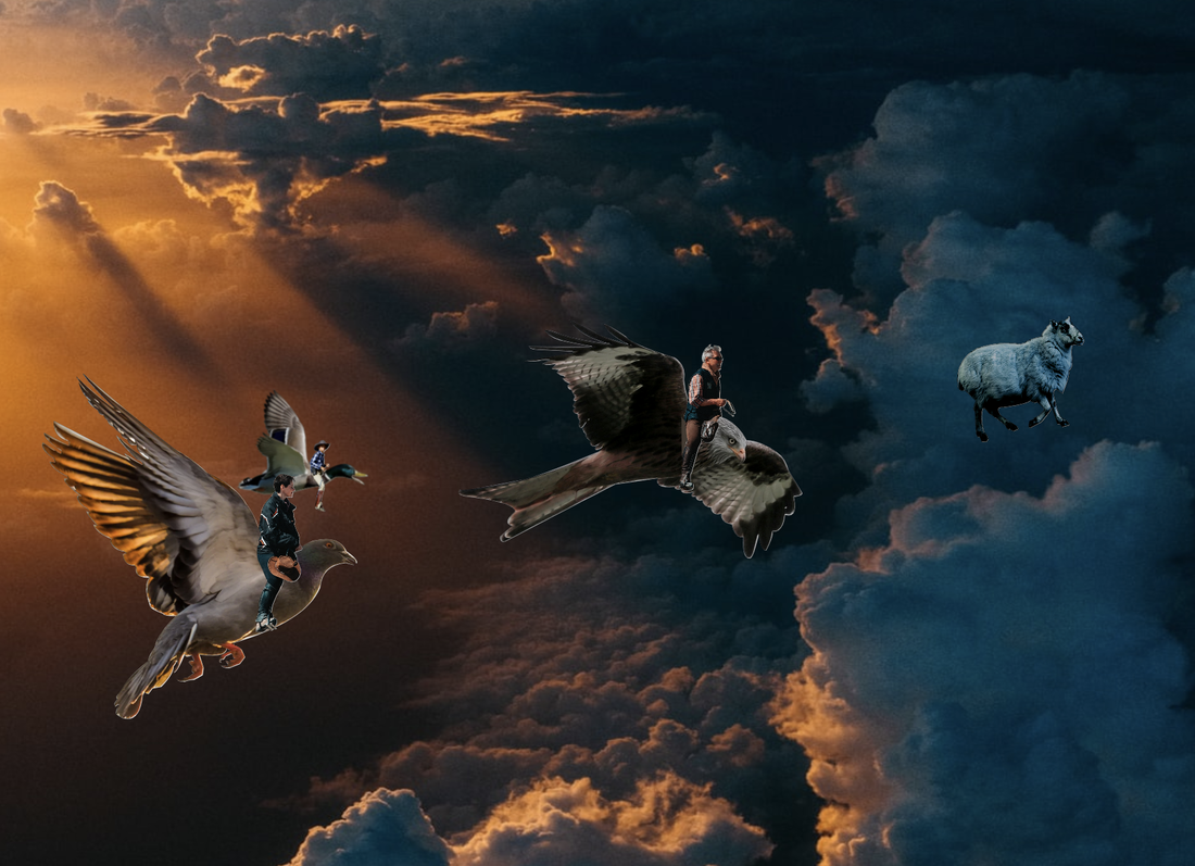 Credits for the Photoshopped Photo:
Matt Seymour:The Old Man on the Falcon & Person on Pigeon Raza Ali: The Pigeon Peter Gonzalez: Child Flying the Duck Vincent Van Zalinge: The Duck Jamie Street: The Sheep James Padolsey: The Falcon Tom Barrett: The Sky This was drawn on a Khan Academy, Computing>Hour of Code>Drawing With Code, and you would find an entire course on how to draw, using codes. I based this drawing off of a snowman I had built last year. It ended up melting and the scarf was missing for an entire month, until It was an early morning in February, and a familiar pine green scarf was dangerously hanging off of a small street drain. The scarf is now back at home, safe, washed, and dry. 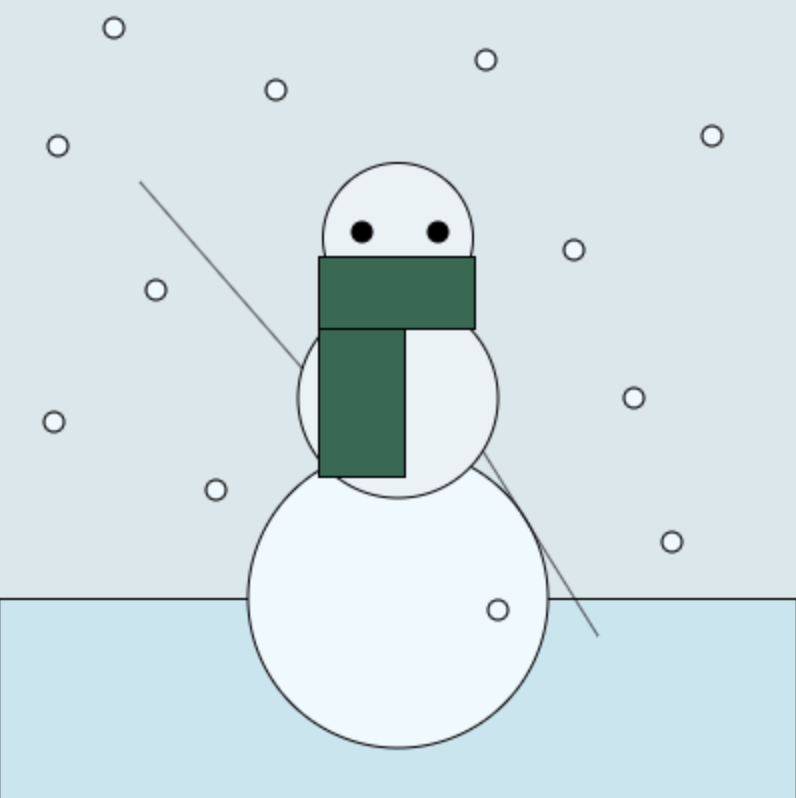 The Code (Feel free to copy and paste, and add on to the drawing, no credit required.): // sky
background(217, 231, 235); // The ground fill(197, 230, 240); rect(0, 300, 399, 100); // simple snowman fill(237, 249, 255); ellipse(200, 300, 150, 150); // arm 1 fill(0, 0, 0); line(165, 200, 71, 92); // arm 2 fill(0, 0, 0); line(300, 319, 168, 107); fill(232, 242, 247); ellipse(200, 200, 100, 100); fill(232, 242, 247); ellipse(200, 120, 75, 75); fill(0, 0, 0); ellipse(220, 117, 10, 10); fill(0, 0, 0); ellipse(182, 117, 10, 10); // scarf fill(37, 107, 81); rect(160, 129, 43, 110); fill(37, 107, 81); rect(160, 129, 78, 36); // snow fill(237, 249, 255); ellipse(250, 306, 10, 10); fill(237, 249, 255); ellipse(318, 200, 10, 10); fill(237, 249, 255); ellipse(288, 126, 10, 10); fill(237, 249, 255); ellipse(357, 69, 10, 10); fill(237, 249, 255); ellipse(244, 31, 10, 10); fill(237, 249, 255); ellipse(337, 272, 10, 10); fill(237, 249, 255); ellipse(139, 46, 10, 10); fill(237, 249, 255); ellipse(58, 15, 10, 10); fill(237, 249, 255); ellipse(30, 74, 10, 10); fill(237, 249, 255); ellipse(79, 146, 10, 10); fill(237, 249, 255); ellipse(28, 212, 10, 10); fill(237, 249, 255); ellipse(109, 246, 10, 10); This is my Gravit Summative design for our technology class, and we were each assigned to create a logo, trademark, landscape, picture, or art, e.t.c... in this specific program. Now for those of you who are curious about how I created the the fireflies, you first create a circle by clicking the middle-upper symbol with the shapes on it, then click and drag your key across the screen into the desired shape and side. Then choose the color, then set it to "gradient radius" or something similar to that, and then set the opacity of the second color to zero. 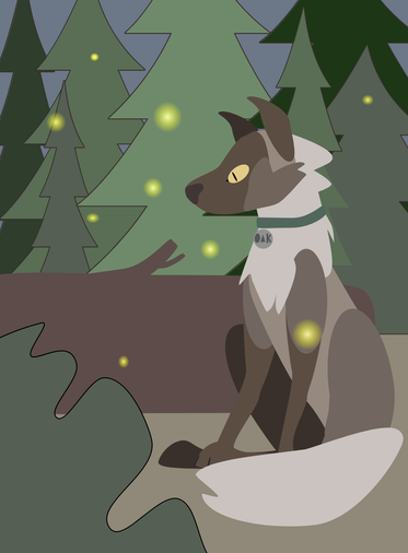 [A photograph of a lone, stray dog taken near a conservation park, enjoying the comfort and condolences of the fireflies.] In the last lesson, we learned how to merge shapes and manipulate and alter shapes. Click on a shape, and on the right side, there will be a chart and a list of options, and for objects with points, apart from squares, can be controlled on how many vertices or "points" they have. As for merging shapes together, you have to click the button that looks like two overlapping black squares on the top-middle of the program, and click on union, that way, your shapes merge into one, and if you drag one of them around the border will still stay as it is.  In this particular lesson, we learned how to control layers, how alignments worked, and how to group objects together. First off, for controlling layers, you could either press on Shift+Command+Up/Down, if you're in need a layer to go all the way to the top or the very bottom. If you just want one object to move down one layer, click on Command+Up/Down Key. As for alignment, you can choose on the very right, eight options you can choose for the object you have selected. This could make for an excellent gradient affect, as shown in the top right image below. In order to group objects together, simply drag your key across the screen, and make sure the slightly-transparent blue box that appears on your screen, touch the objects you want to group together. Then release, and click simultaneously on your computer touchpad with two fingers, then a list of options will appear on your screen, select group, which has a G+Command in grey letters next to it. Click on that, and it'll group all the objects together. 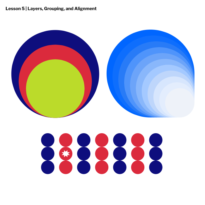 |
AuthorTree is a student, who likes to create digital art, scrapbook, hike in the woods, birdwatch, and write in their spare time. Archives
April 2020
Categories |
 RSS Feed

