|
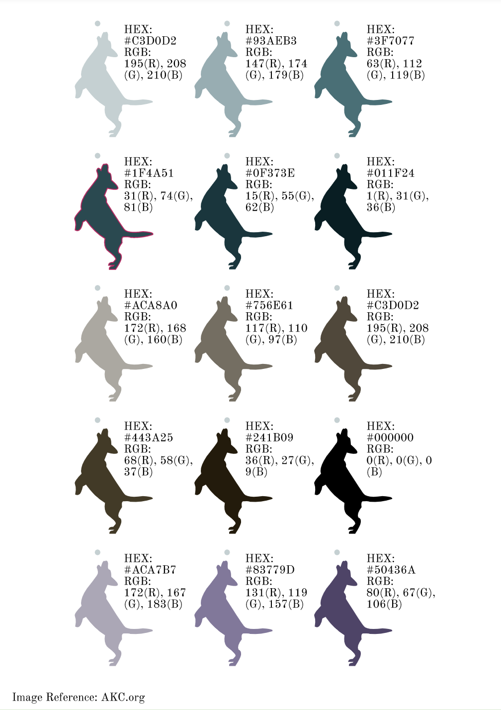
I didn't face something that I would necessarily call a challenge, however, I think the lengthiest process I went through while creating this project was writing down the Hex Code and RGB, and it was rather hard to remember the RGB since you can't copy and paste it like you could with the Hex Code, however there was no light bulb genius moment, I just had to deal with the lengthy process with patience. I personally think that I succeeded in tracing the picture with the pen tool, to make a silhouette of a decent-looking dog. For this particular project, I used the Pen tool and textbox option in Gravit.
0 Comments
Typography is the appearance or style of the text, something that we encounter often in the digital world and especially in graphic design. Typography is important because you want to deliver your ideas and messages in the demeanor that you mean it to be to your reader/audience/viewer, but if handled incorrectly, your audience would be confused. “Each font has a personality and a purpose”. The quote I just wrote above means that the kind of font will impact the overall personality of the creation, design, or message, and how your audience will perceive it. Writing a letter to your boss in Comic sans is not a good idea, as it would give the receiver the wrong idea. In this particular unit, we learned the five "genres" of font, listed below; Serif Font - Has "feet", and usually used in large blocks of text, and is often used in print. Sans Serif - Does not have "feet", and is good for headlines, titles, smaller chunks of text, and used often on the web. Monospaced - Each letter takes up the same amount of space, doesn't work well for large blocks of text, and is often used in coding. Script/Handwritten - Cursive, calligraphic, or handwritten, sometimes difficult to read, good for logos, large headlines, and details. Novelty - Good attention getters, best used sparingly, for emphasis like in an infographic or poster. It could also be used as a title if readable from a distance. Many times, the popularity of a font comes and goes. Typeface ComparisonIn this assignment, we were instructed to find five fonts that both individually belong to different categories of font; Serif, Sans Serif, Monospace, Novelty, and Script. Then we were supposed to give examples of that font in a sentence. For this assignment, I used; Old Newspaper Types, Sans Serif Shaded, Bittypix Monospace, Marcelle Script, and Fh Script. 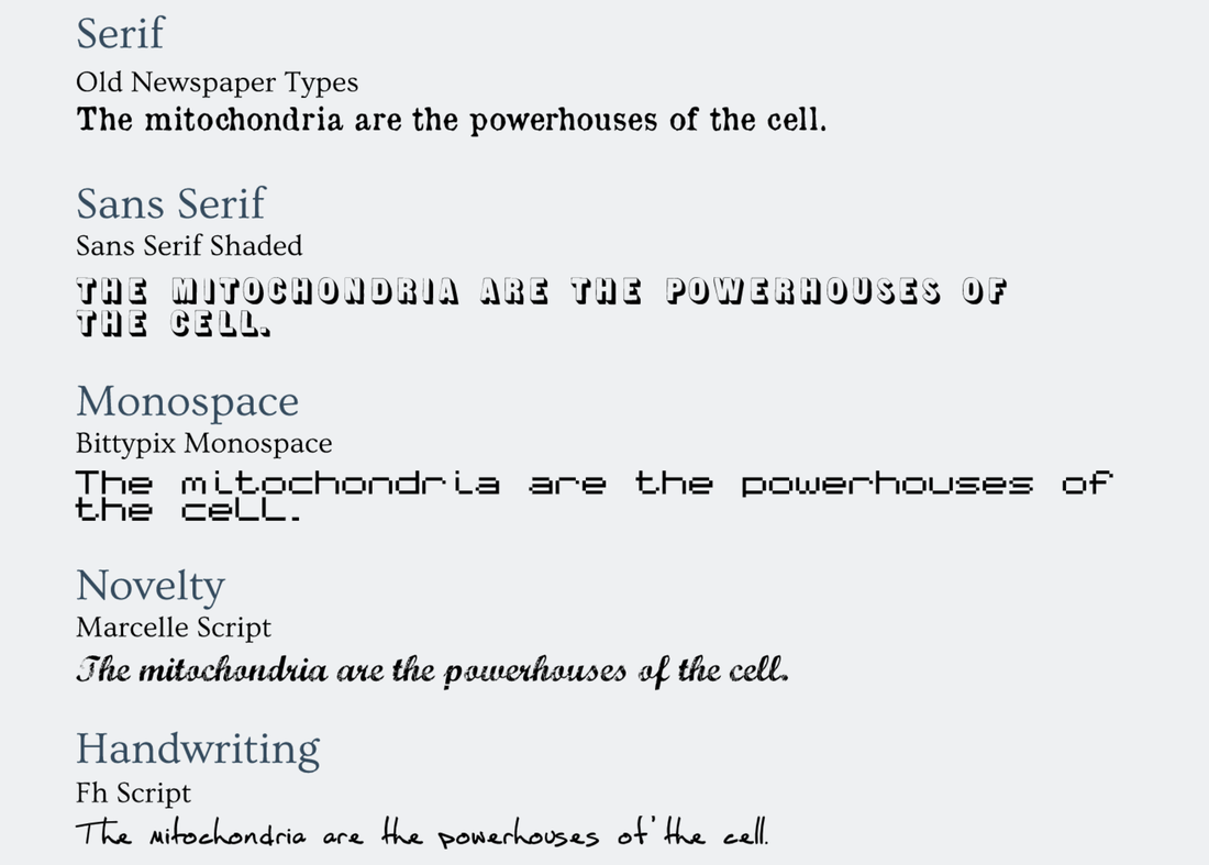 Word PorFor this project, we were expected to create good and bad examples of font uses. For this project, I had to get creative and try to think up of very bad examples. Personally for me, I think the best example of a bad font was when I wrote "Die Hard", a christmas Movie, in the Mountains of Christmas font. A very valuable lesson I learned in this Unit, was spacing and alignment. The importance in spacing and alignment is that if the fonts aren't well aligned, the viewer would have difficulty reading, which is why you should use center alignment only for the title, or don't use it at all. 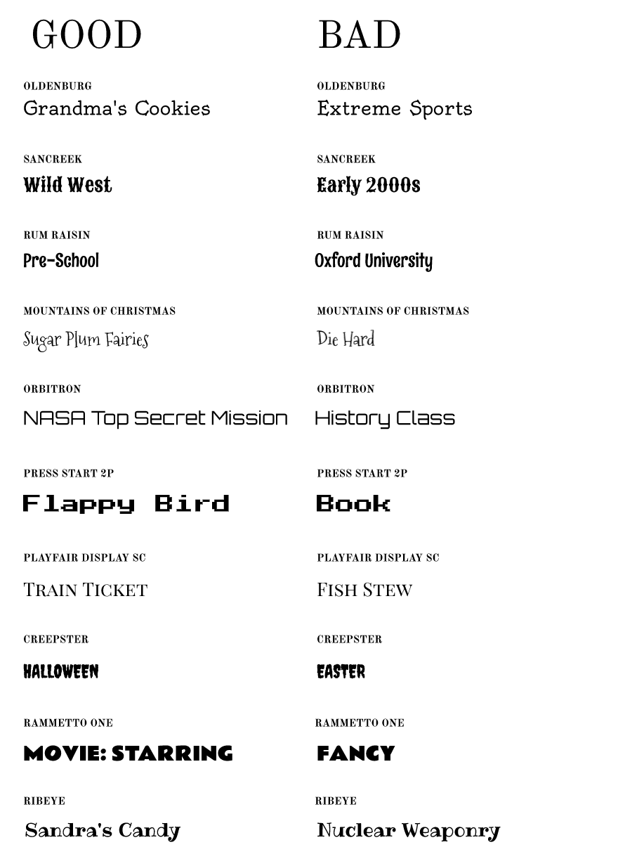 |
AuthorTree is a student, who likes to create digital art, scrapbook, hike in the woods, birdwatch, and write in their spare time. Archives
April 2020
Categories |
 RSS Feed

