|
For this assignment, we were supposed to create a logo. I decided to make a logo an obscure indie recording studio would most likely have, and what's more obscure than a dog made of clay. I have discovered the existence of clay dogs, and the sight of a very awkward-looking animal accumulates innocent joy that comes from the pit of your heart, which was the reason why I had chosen it. I would say that trying to nail a very watered-down version of a dog's anatomy was the most tedious, as well as simplifying and "translating" the design to look very geometric and simple looking as possible. While it is rather detailed for a logo, I still had to make it so that it wouldn't look like the other dogs. 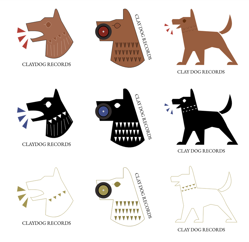 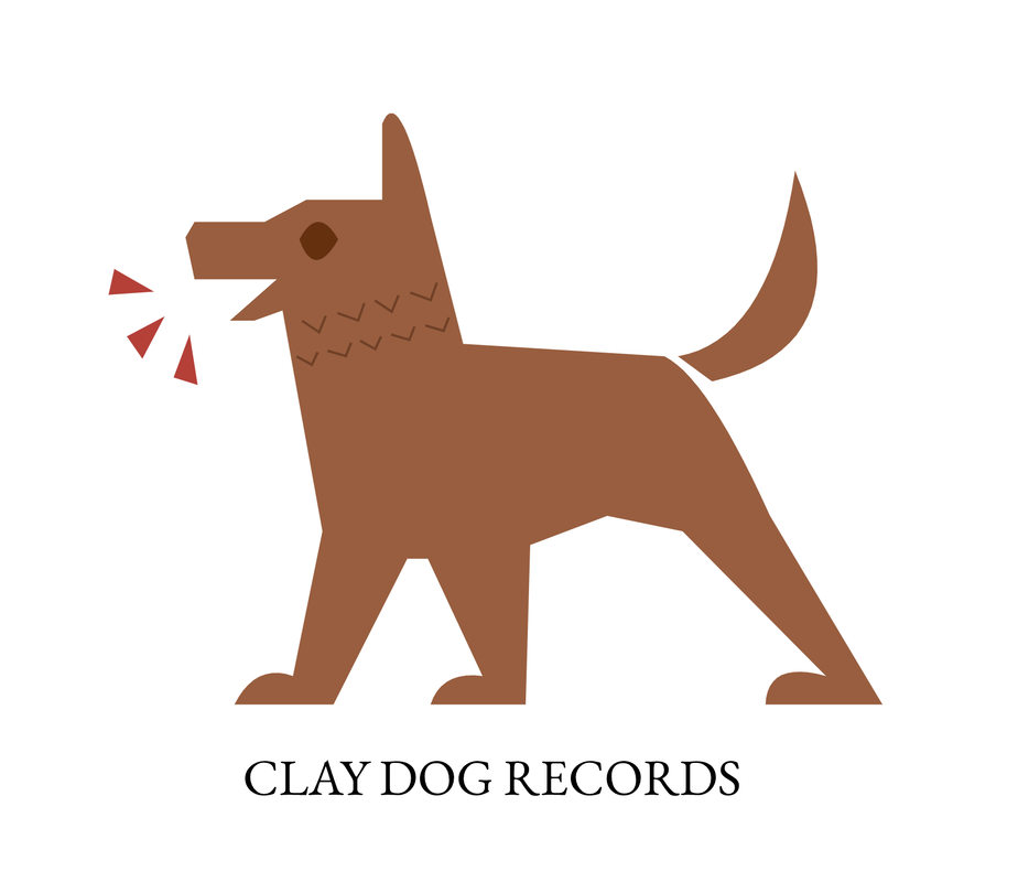 Most appealing logo
0 Comments
Our task was to brainstorm a logo for a company or to represent a product or ourselves. Lately I've been researching on old civilizations and particularly the Romans, Etruscans and the Neo Assyrians, for the sake of creating the setting of my graphic novel. So as a creator, I saw this as a perfect opportunity to practice on nailing that Assyrian clay dog figurine look. In addition, I inspired by those obscure, hippy record companies that nobody knows of, that only sell their albums digitally on SoundCloud. 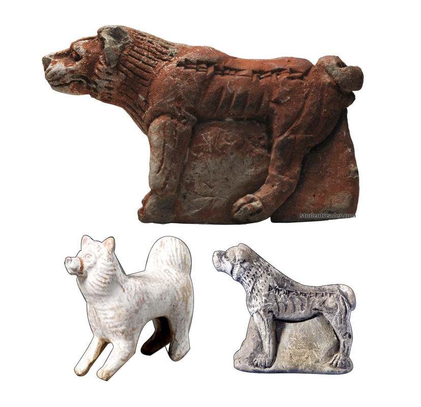 As I progressed, I tried to make the designs more simplistic for my sake. Originally for the rough draft, I wanted to use lines and streaks for the dog's mane(?), then I switched to using almost-triangles. Midway through, you can see that I added in three triangles to represent barks, in a way, to represent song. I threw my ideas onto the paper with whatever design or feature I added or removed from the drawing. While similar, I tried to make them slightly different, since small details can surprisingly add another whole feeling to the logo when viewing it alone. One of my favorites are number 5 and6. 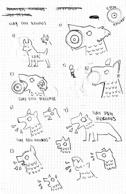 |
AuthorTree is a student, who likes to create digital art, scrapbook, hike in the woods, birdwatch, and write in their spare time. Archives
April 2020
Categories |
 RSS Feed

